-
Architects: SAOTA
- Area: 1865 m²
- Year: 2016
-
Photographs:Adam Letch
-
Manufacturers: Linvisibile, Antonio Lupi, Ernestomeda, Fleetwood, Heritage Vine, Poliform
-
Lead Architects: Mark Bullivant, Tom Burbidge

Text description provided by the architects. SAOTA’s first completed project in Los Angeles, Stradella, is a remodel of an existing 1970’s house on a beautiful promontory in Bel Air. The original layout of site and dwelling were well planned to ensure privacy from the street and to address spectacular views over the LA basin, capturing the full panorama from Downtown to Century City, with mountains to the east and ocean to the south.

On the client’s instruction to expunge all traces of the original Spanish style architecture, SAOTA decided to strip the existing house back to its timber skeleton, maximize the square footage and, by reinforcing or extending where necessary, create generous openings to draw the beautiful West Coast light, the rolling vistas and the verdant setting deep into the floorplan. This concept of “inviting the outside in” encapsulates the SAOTA approach, and at Stradella these informed design decisions ranging from space planning to façade design, landscaping, lighting, window configuration and shading details.

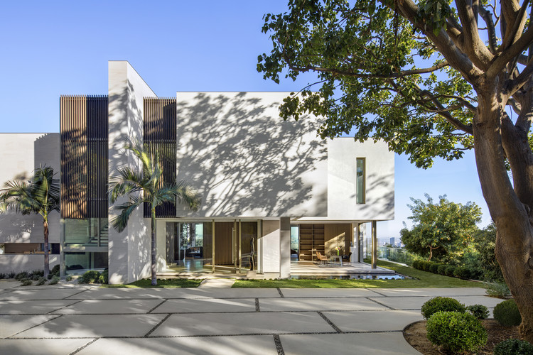
An attractive approach cut into deeply wooded hillside arrives at a leafy forecourt signaling the entrance of the house. The arrival façade is reimagined as a sculptural composition – a massive buttress ties the house into the hillside; blank, stone-faced walls, incised with vertical screens hover over glazing, inviting the eye in and through. From the entrance lobby, an asymmetrical passage carved through the main body of the house intentionally delays the reveal of the Downtown skyline, framed by the high ceilings of the great room. There is a deliberate transition as the weighty forms of the entrance, anchored into the hillside, give way to a lighter structure hanging vertiginously over it, aligning to the city grid and framing the views.

This nod to the utopian Californian Modernism of the Case Study Houses is reflected in the porous nature of the reconfigured floorplan which aims to capture the essence of Californian Living, with internal spaces feeling light, fresh and open, connecting the various functions of the house for modern family living and grand entertaining alike. Where possible, walls were replaced by full height glazing with sliding windows pocketing or stacking to create generous openings. Key bedrooms and bathrooms were re-designed to spill out onto external terraces suspended over the sparkling night skyline.

The lush wooded setting, so apparent in the approach to the house, seems to sweep through it to the front terrace which was reconfigured with a new pool and linear planters to animate views from within the house. A generous new linear canopy amplifies the width of the site, creating natural extensions of internal living spaces, improving flow between the various functions of the house, and providing comfortable spaces for outdoor dining and lounging. This iconic, 40m (131ft) long canopy – its skinny, expressed structure reminiscent of Koenig’s Stahl House – floats effortlessly over the east terrace as it draws a deliberate frame around the quintessential blue sky and palm trees. It lends new coherence to the remodelled elements of the former dwelling - and to a new theatre and dining wing to the north of the site. This addition bridges the original exit driveway and defines a new motor court to the rear of the property at a lower level. A new gym and spa, a cellar and staff spaces are all accommodated at this basement level allowing the main living spaces at first floor to remain light and open.

The overall palette balances warm and natural tones against the bold masses and crisp linear forms which characterize the architecture. An elegant canvas of French Limestone and white plaster walls is enlivened inside and out by bronze anodized aluminium screens, and light grey window frames. Internally, grey-washed ash millwork and doors complement both limestone floor tiles used throughout the living spaces and the oak flooring in the bedrooms.

Carefully designed lighting accentuates the architecture and responds directly to furniture layouts, ensuring that a sense of intimacy is established throughout the open spaces. Concealed fixtures and discreet layouts create a comfortable night-time ambience; the twinkling LA Skyline remains the star attraction.

Landscaping was designed to enhance the already luxuriant setting. It was impossible to introduce a courtyard into the heart of the plan, and so the planted spaces were critical, softening the look and feel of the contemporary forms and allowing a more intimate experience of the leafy site. Existing twin palms were retained at the pool terrace and feature in views out of the solarium bar and master bedroom suite, whilst low level planting and lawn to the terraces ensure functional outdoor spaces and uncluttered views of the horizon. To the rear of the site additional planting enhanced the tree-lined drive whilst a characterful mature tree was retained in the forecourt providing a real sense of place and a backdrop for the study and entrance lobby.

Going well beyond the remit of a traditional remodel, SAOTA has utterly transformed the existing house into a home that functions at the highest level and establishes a fresh contemporary aesthetic in the tradition of Californian Modernism.


